Tātai Aho Rau Core Education blog
He kōreroreo, he whakaaro
Discover the latest insights on education and teaching from our blog.


Popular posts
Te Tiriti: how are the Māori and English versions similar?
... Read more >
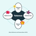
Talanoa is for everyone: a guide for educators
Using the talanoa process enables us to learn more about each other's backgrounds and gives us a better understanding of why we think, feel or act in certain ways.... Read more >
The progression of LEARNZ virtual field trips
LEARNZ virtual field trips is undergoing an evolution from a science-based programme to a social and historical platform that places people, their stories and knowledge at the forefront of information…... Read more >